

Christ Church Episcopal School
ABOUT THE BRAND
Christ Church Episcopal School (CCES), located in Greenville, South Carolina, is a private, coeducational college preparatory school serving students from Primer through Grade 12. Established in 1959, CCES fosters a culture of kindness, respect, and inclusion, preparing students to think deeply, act responsibly, live vigorously, believe faithfully, lead resolutely, and create imaginatively. This commitment to academic excellence and personal growth has helped establish CCES as a leading private school in South Carolina, earning top rankings across multiple categories on Niche.
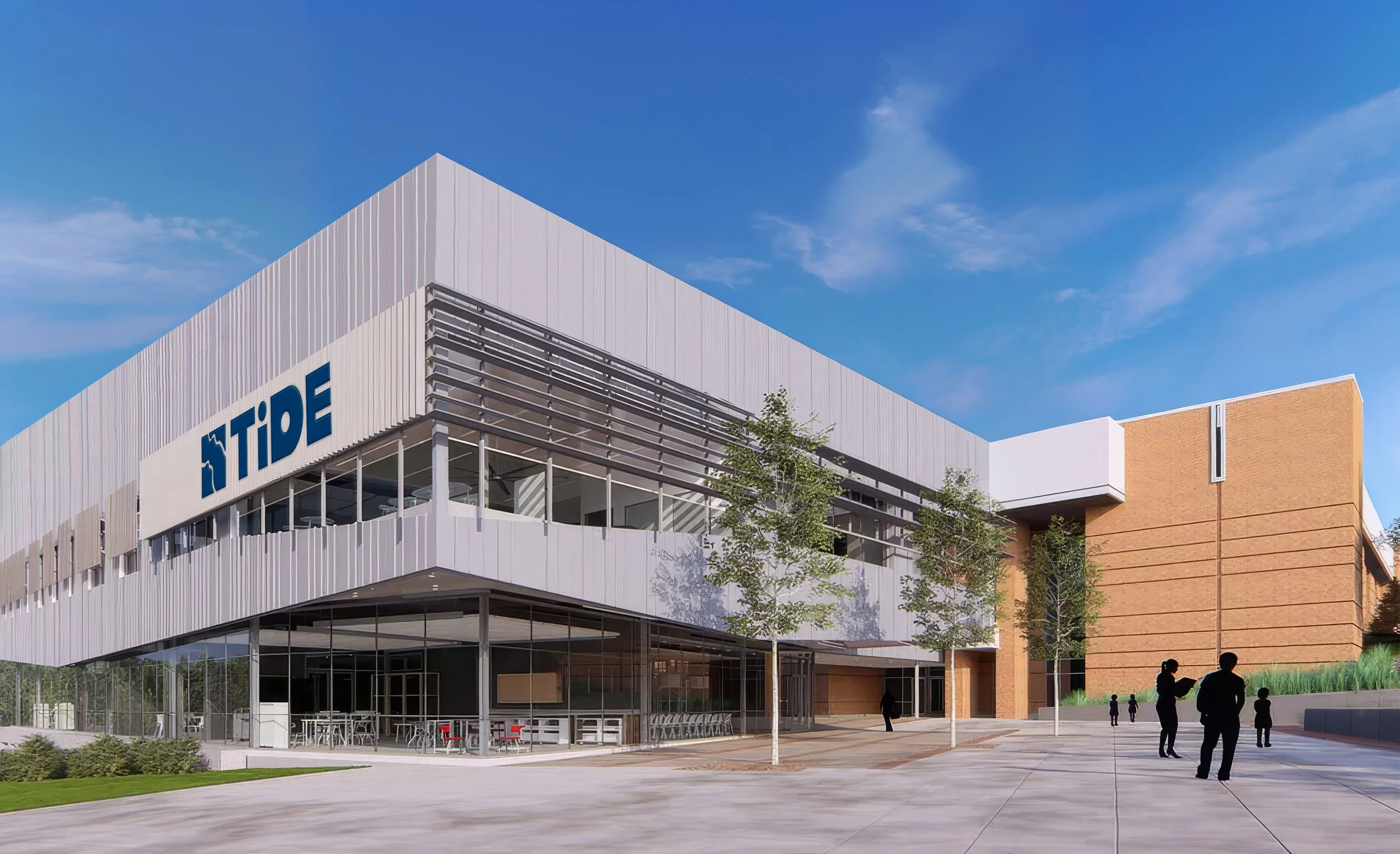
When CCES approached us to refresh its brand, the scope included creative direction, a brand retouch, magazine design, and branding for TiDE, a new 22,000-square-foot academic building. The challenge was to evolve an established identity while honoring the tradition and brand loyalty that make CCES distinctive. The resulting direction focused on thoughtful refinement and elevation, introducing a fresh, clean, and inspired feel while preserving the character of a beloved institution.
INDUSTRY
Education
SERVICES
Animation
Branding & Brand Retouch
Creative Direction
Graphic Design
Magazine Design
When approaching the Admissions Viewbook, we embraced a high-impact, photography-driven, minimalist design that prioritizes showing the student experience over telling its story.
THE VIEWBOOK
PHOTOGRAPHY HAS BEEN BLURRED FOR STUDENT PRIVACY
Designed to balance the delicate serif typeface of the primary brand, the TiDE identity features bold, block lettering that introduces a youthful, confident edge.
Each letter incorporates distinctive design elements that reflect its corresponding meaning, creating a cohesive visual identity grounded in purpose and concept.
TiDE Branding
Rooted in rules, structure, and code, technology should be reflected in a visual identity that feels balanced, precise, and uniform.
The “T” most closely mirrors the “E” in the wordmark, with both letters reinforcing the systematic overlap and structural balance that define the overall design.
Technology
A concept rooted in fluidity, adaptability, and forward-thinking innovation. The lowercase “i” reflects an unconventional approach, embodying the “against the grain” mindset essential to pushing boundaries and challenging the status quo.
Innovation
A deliberate duality between softened corners and sharp, angular edges, the uppercase “D” balances opposing forms to reflect the interplay between symmetry and complexity inherent in creative principles.
Design
The negative space forming the letter’s “arms” features subtle breaks that evoke the rungs of a ladder. This detail reflects the deeper meaning of entrepreneurship—not simply the act of starting a business, but the creation of something from an idea, built one intentional step at a time.
Entrepreneurship
PHOTOGRAPHY HAS BEEN BLURRED FOR STUDENT PRIVACY
Designed by isolating sound waves from the words innovate & experiment, the Brand Mark breaks into three units signifying the “Cornerstones” of the TiDE curriculum.
TiDE Brand Mark